The latest ‘2011 Santa Monica Airport Noise Management Report‘ has now been released. It shows that despite all the community outcry, improvements through pilot outreach, and voluntary changes by flight schools, activity at SMO increased in virtually every area, as did complaints. Little surprise then that community anger continues to rise, given SMO’s lack of progress making any credible attempt to be sociable. The 2011 noise report strongly confirms and vindicates what the community has been saying since 2010. To summarize the report’s findings:
Overall operations increased by 5% during calendar year 2011 compared to 2010
Propeller aircraft operations increased by 5%
Jet operations increased by 2%
Helicopter operations increased by 17%
Noise violations increased by 16%
Voluntary night arrival curfews increased by 8%
During 2011, airport staff received a total of 3,693 community ‘inquiries’
This is lower than the 44,269 complaints triggered by the 250 degree heading test in 2010,
but it is more than 10 times the normal complaint level in years from 2009 and earlier!
Related presentation slides for the September 25 Airport Commission meeting can be found as follows:
Noise Management Report: here
CNEL Contours and noise health effects: here
The only thing in the report to decrease were the morning departure curfew violations which went down by 18%. When we combine the noise report with the ‘2011 Airport CNEL Contours‘ document which was also just released, we can begin to see what is going on in far more detail.
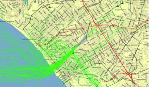 |
| Sample Propellor Departures (August 1-8, 2011) |
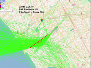
In the prop departures image above, note the large number of green tracks to the north of the runway direction. If planes were following the ‘fly-friendly’ program we should see the green tracks bend slightly to the south and then go along the golf course until either Lincoln (if turning south), or the coast line if turning north. We see just a small sign of following the golf course (compare to jet departures below which fly straight out, ignoring the golf course turn). More importantly there are a large number of tracks that turn both north and south well before they should. This disregard for the fly friendly flight paths was triggered for all prop flights (VFR as well as IFR) by the 2010 FAA 250 degree heading test. All SMO Flight paths never returned to normal after that test was ended.
Note how many of the early flight paths to the north loop around and pass back to the south near the end of the runway. This is a new phenomenon known as the ‘mini-route’ which is a quickie way for planes to go south without having to fly out to the coast. Of course these prop planes must gain altitude very quickly in order to be high enough to pass back over the SMO departure path, to do this their engines must be at high power and make more noise. Thus this new ‘mini-route’, which was never advertised to the community (unlike the 250 heading) is probably a significant contributor to the increased neighborhood noise problem from SMO. Apparently the FAA has decided that openness is too much of a hassle so the mini-route was slipped in quietly (no pun intended).
 |
| Sample Propellor Arrivals (August 1-8, 2011) |
 |
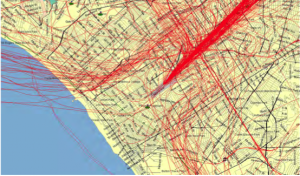
Sample Jet Operations (August 11-31, 2011)
|
In the green jet departure traces above we can clearly see that many of the aircraft begin their turn to the north long before they reach the coastline. These traces should all continue straight until the coast before turning. These early turns, when added to the prop departure deviations discussed above account for the 1/3 of all complaints in 2011 that related to flight path deviations. This class of complaints is rapidly expanding as SMO flight path deviations venture further and further afield, and as traffic levels increase.
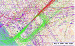 |
Composite SMO Flight Paths from May 1, 2009 – Before the FAA’s 250 degree heading test
|
If we compare the 2011 flight path traces to the composite image above for SMO flight paths before the 250 degree heading test, the differences are quite clear. Ignore the purple lines in the 2009 image, they are other planes flying over SMO airspace (e.g., to LAX).
There are virtually no green traces to the north before the coast line in the 2009 image. The 2011 images are completely cluttered with green traces to the north. Don’t let anyone fool you that nothing has changed about SMO flight paths, the evidence does not lie. Look how the 2009 departure traces (jets and prop) are in such a narrow band all the way to the coast (or to Lincoln for prop planes doing pattern flying to the south). No sign of the mini-route in this image. Now look at the 2011 prop plane and jet traces and tell me that things at SMO have not got completely out of control.
This difference is at the heart of the continuous argument where the community says there are more planes flying over our heads than ever, while airport staff keep saying that can’t be true because there are less departures from SMO than there used to be. Well, the community is right, if you live anywhere else other than in a straight line with the runway, there are indeed far more planes flying over your heads than there were. The staff may have been right about departures counts up until 2010, but as of 2011 it is clear even that argument holds no water.
 |
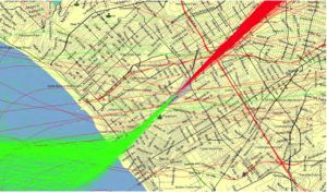
Sample Departure Tracks Recorded during the 250 degree heading Test
|
Just to drive home the point, the image above shows the departure tracks during the 250 degree heading test that triggered those 44,269 complaints in 2010. Looks exactly like a superimposed image of 2011’s jet departure tracks plus 2011’s prop plane departure tracks doesn’t it?
In other words, the 250 degree heading is de-facto in operation still, or if not, it is certainly the wild west at SMO as far as flight paths are concerned. Don’t let anyone tell you different, there really are more planes over your houses.
Airport Trends the wrong way in 2011
The latest ‘2011 Santa Monica Airport Noise Management Report‘ has now been released. It shows that despite all the community outcry, improvements through pilot outreach, and voluntary changes by flight schools, activity at SMO increased in virtually every area, as did complaints. Little surprise then that community anger continues to rise, given SMO’s lack of progress making any credible attempt to be sociable. The 2011 noise report strongly confirms and vindicates what the community has been saying since 2010. To summarize the report’s findings:
Overall operations increased by 5% during calendar year 2011 compared to 2010
Propeller aircraft operations increased by 5%
Jet operations increased by 2%
Helicopter operations increased by 17%
Noise violations increased by 16%
Voluntary night arrival curfews increased by 8%
During 2011, airport staff received a total of 3,693 community ‘inquiries’
This is lower than the 44,269 complaints triggered by the 250 degree heading test in 2010,
but it is more than 10 times the normal complaint level in years from 2009 and earlier!
Noise Management Report: here
CNEL Contours and noise health effects: here
Note how many of the early flight paths to the north loop around and pass back to the south near the end of the runway. This is a new phenomenon known as the ‘mini-route’ which is a quickie way for planes to go south without having to fly out to the coast. Of course these prop planes must gain altitude very quickly in order to be high enough to pass back over the SMO departure path, to do this their engines must be at high power and make more noise. Thus this new ‘mini-route’, which was never advertised to the community (unlike the 250 heading) is probably a significant contributor to the increased neighborhood noise problem from SMO. Apparently the FAA has decided that openness is too much of a hassle so the mini-route was slipped in quietly (no pun intended).
In the green jet departure traces above we can clearly see that many of the aircraft begin their turn to the north long before they reach the coastline. These traces should all continue straight until the coast before turning. These early turns, when added to the prop departure deviations discussed above account for the 1/3 of all complaints in 2011 that related to flight path deviations. This class of complaints is rapidly expanding as SMO flight path deviations venture further and further afield, and as traffic levels increase.