Last night at the Airport Commission meeting (agenda), we were treated to another bewildering episode in the city’s purported airport visioning process. See here and here for our comments on previous episodes. More on that in future posts. In this post I want to focus on just one small aspect of what was presented, namely two spreadsheets provided by airport staff as initial progress in work towards the phase III visioning goals.
Firstly, staff distributed a spreadsheet described as containing airports that were ‘similarly situated’ to SMO and which had noise restrictions in place. The stated purpose of the list was to allow staff to look into ‘best practices’ at other airports and come back to the city council with final recommendations in February at the wrap up of the phase III visioning. There were 43 airports on the list deemed ‘similarly situated’, and a number of attendees and the airport commissioners questioned exactly how the list of airports had been chosen, and what was the purpose of the list.
A complete list of airports with noise restrictions is maintained by Boeing and can be found here. This is the logical starting point for coming up with such a list, and we did exactly that today to try and understand the reasoning behind the staff list. The Boeing list currently contains 281 entries for the US which typically list the following kinds of noise abatements procedures (NAPs):
1) Continuous Descent Arrival (CDA)
2) Airport Curfews
3) Preferential Runways
4) Operating Quotas
5) Engine run-up restrictions
6) APU operating restrictions
7) Noise budget restrictions
8) Noise surcharge
9) Noise Mitigation/Land use:
a) Sound Insulation (residences & public buildings)
b) Purchase assurance for homeowners within noise contours
c) Avigation easements
d) Zoning laws
e) Real estate/property disclosure laws
f) Acquire land for noise compatibility
g) Population within noise contours relative to aircraft operations
h) Airport noise contour overlay maps
10) Noise monitoring system
11) Flight track monitoring system
12) Noise level limits
12) Stage 2 restrictions
13) Stage 3 restrictions
Of these 281 entries, 72 have curfews (as does SMO). All but 5 of these have Noise Abatement Procedures (NAP) like SMO. Just 21 of the remaining entries in this list have maximum noise limits (like SMO). Of the remaining 21, there is only one pure General Aviation (GA) airport (i.e., no scheduled passenger services) with a single runway and a tower, the rest are larger airports, often international. That remaining entry is Santa Monica Airport, it is unique. So much for finding any airports to compare SMO to, there aren’t any if you start with noise restrictions as a premise.
Staff stated that their list was of ‘similarly situated’ airports to SMO, including noise restrictions. Since this seems at variance with the Boeing database, we must look for some other logic to the list handed out at the airport commission meeting last night, and how/why were the airports in the list chosen. One very obvious clue is that half of the columns in the spreadsheet relate to flight schools and to pattern flying percentages, both things which on the surface of it appear completely irrelevant to examining ‘best practices’ at other airports in terms of noise restrictions. A quick look down the ‘Local Operations’ column in comparison to the ‘Total Operations’ column reveals that most of the entries in the list seem to have unusually high levels of pattern flying (i.e, local operations).
Pattern flying seemed to be a prime focus last night since staff also provided a spreadsheet for an aircraft operations study conducted at SMO during September containing the following findings regarding pattern flying at SMO:
The most surprising thing about this table is how low the percentage for pattern flying was found to be in the staff study compared to data from the FAA tower (for October the percentage was 35% according to the FAA). This also appears to contradict the findings from past CASMAT studies.
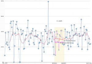
This anomalously low pattern flying measurement in staff studies has happened before, and CASMAT posted an extensive report revealing the possible reasons behind them at that time (see here). This time round, CASMAT was given early access to the staff study, and once again looked into the reasons for this anomaly. The staff study occurred between Sept 10, 2012 and Sept 23, 2012, and involved a number of college interns noting tail numbers and aircraft activity from the observation deck at the airport for the entire day over a two week period. An immense and worthy effort to be sure. With the release of the FAA tower data for October in the noise report (see here), it became possible to plot the percentage of local traffic versus total (essentially the same as the pattern flying percentage) for an extended period on both sides of the staff study. This allowed us to check if the curve was any different during the study period. We plotted the pattern flying percentage for every day from July 1, 2012 to October 31, 2012 including the period of the staff study. The chart below is the result (click image to enlarge).
 |
| Pattern Flying levels from July 1 to Oct 31 per FAA tower – overlaid on Staff study period. |
As can be seen from the chart, the yellow area (which represents the period of the staff study) lies at the bottom of an extended valley in the one-week running average for the pattern flying percentage (the red line). Just like previous staff studies, this anomalous dip does not occur anywhere else in the curve, and is the only place in the entire graph where it is possible to measure such a low level of pattern flying activity for an extended period. Other shorter dips in the curve are triggered by bad weather, which causes the daily pattern flying percentage to drop essentially to zero, and these dips consistently recover within a matter of 5 days at most. In contrast, the unique dip around the staff study is not preceded by a bad weather event, and lasts for a total of 24 days in the moving average line. There is no other such dip to be found anywhere.
The average pattern flying level during the staff study according to FAA tower data is 31%, staff measured 26%, and the average level for the entire year of 2011 (according to the tower), as pointed out by Commissioner Grossman during the meeting, is 37% (see 2011 Noise report here). Something is clearly wrong. When Commissioner Grossman pointed out this discrepancy, the response from Bob Trimborn (Airport Director) was that “its just two weeks”. That may be true, but it is a very special and anomalously low “just two weeks”.
The low activity during the staff study, just like previous staff studies, suggests study results cannot be considered valid as a measure of absolute pattern flying levels. Looking at the complete curve, it is clear that the moving average (red line) spends most of its time well above the 26% of total operations found by the staff study for pattern flying. In other words, average pattern flying levels are actually a lot higher than reported by the staff study, and as can be seen from the daily curve, it is commonplace for pattern flying to exceed 40% of total operations, sometimes well over 50%. One day at the beginning of September it was 80% of all flights according to FAA data.
Perhaps the cause of the anomaly is that flight schools were aware of the presence of numbers of college interns on the observation deck taking tail numbers and noting ground maneuvers during this period, and so they modified their behavior so as to lessen the impact that the study would show them to have. This would be expected in any adaptive system where the subject of an experiment is aware that the experiment is taking place and that the findings may have direct bearing on the subject’s future. It is somewhat like trying to see if people run a red light at an intersection by placing a squad car at the intersection to watch what happens. Of course the only ones who will run the red light during such a study are those that failed to see the lurking squad car. The study methodology has thus perturbed what is being measured and so caused invalid results. The long term chart above shows that those earlier concerns may have been justified. This is the third staff study to show anomalously low pattern flying activity at SMO. There seems to be a trend developing.
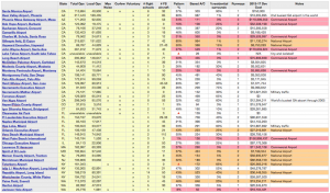
Coming back to the staff handout at the commission meeting last night, lets add some additional columns to the staff chart in order to look at why the airports might be construed to be ‘similarly situated’ or if not, why they might have been chosen. The table below (Excel version link:here – includes hyperlinks to airports) is the result (click image to enlarge):
 |
| Staff ‘Similarly Situated Airport’ spreadsheet augmented with additional information |
The yellow area of the spreadsheet was the data originally presented by staff, the other columns we have added. The ‘Pattern%’ column shows the pattern flying percentage (note: 37% not 26% for SMO). The ‘Based A/C’ column gives the number of aircraft permanently based at the airport concerned – taken from Wikipedia airport articles (via hyperlinks) or from Appendix A (link) of the FAA’s 2013-2017 National Plan of Integrated Airport Systems (NPIAS) to Congress on September 27, 2012. This document details the FAA’s national plans for all major airports within the US including number of aircraft and anticipated spending on those airports by the FAA from 2013-2017 (the source for the ‘2013-17 Dev Cost’ column in the spreadsheet above). The ‘Runways’ and ‘Notes’ columns were derived from the Wikipedia articles for each airport. Finally for each airport listed we zoomed in on the airport using Google Earth and estimated the percentage of residential housing that immediately surrounds the airport, the result is shown in the ‘%Residential Surrounds’ column.
Firstly, we can effectively ignore all red or orange highlighted rows in the table since these correspond to large commercial or national airports respectively and cannot by any stretch of the imagination be considered ‘comparable’ to SMO. The two busiest GA airports in the world also appear on this list despite being nothing like SMO.
A number of things leap out at us from what is left. If we look at the Residential% column, SMO is almost 90% surrounded by nearby residential neighborhoods. The closest any other airport on the list comes is 75%, and most are well below 50%, many at 0%. If we take into account only airports with one runway like SMO, the next highest residential percentage is a mere 5%. Clearly then, if staff means by ‘similarly situated’ the relationship of the airport to surrounding residential neighborhoods, Santa Monica has no peers anywhere in the list (or elsewhere), it is one of the most tightly surrounded airports there is. Comparing pattern flying percentages with airports with trivial amounts of residential surrounds cannot be considered valid, and the purpose of including local and total operations in the original staff table is thus a mystery.
Pattern flying shouldn’t be happening at all at SMO given its residential surroundings. Period. Nothing more to study (or should I say ‘vision’), we simply have to terminate the flight school leases in 2015 when they expire. As Commissioner Grossman pointed out at the meeting, there are a number of airports on the list with zero flight schools, including some very large airports, so it is clearly possible to get rid of flight schools and that should be ‘visioned’.
Next if we look at the FAA’s estimate of the amount of money to be spent on the airport between 2013 and 2017, Santa Monica once again stands out. While most airports on the list have spendings in the 10’s or 100’s of millions planned, Santa Monica’s anticipated FAA spending is just $750,000. In fact only two other airports on the list Torrance and Clearwater Air Park have lower spending (both zero).
More alarming is the fact that the FAA thinks it is going to spend $750,000 when the city has publicly committed not to take any funding from the FAA in the future since such funding comes with additional obligations that will tie the cities hands as far as determining the future of the airport. It is to be fervently hoped that the $750,000 figure on the FAA list is a mistake, and not a result of some unknown agreement between city staff and the FAA that the public is unaware of. If it were, this would be a betrayal of the first order. The figure should be $0.
The FAA’s only way to enforce its will on cities is through grant assurances that come along with that city’s acceptance of FAA money. All the other airports in the list (bar 2) have accepted and will continue to accept vast quantities of FAA money and thus have given up their rights to determining their airport’s future. To be fair, with residential percentages mostly below 20% in these airports, it is likely that not many people care.
This is certainly not the case in Santa Monica where 80% of the respondents to three independent surveys have asked that the airport either be closed completely or its operations severely curtailed. It is the lack of any mention of curtailing airport operations whatsoever throughout all three phases of the city’s visioning process that has caused the public distrust and backlash. Once again last night, despite public and commission calls to ‘listen to what the residents asked for’, city staff studiously and deftly avoided ‘visioning’ anything that might actually reduce operations and make things better.
Last night served only to aggravate the situation; it is hard to see how further work on either of these spreadsheets will lead to anything that will meet public expectations from the ‘visioning’ process.
A tale of two spreadsheets
Last night at the Airport Commission meeting (agenda), we were treated to another bewildering episode in the city’s purported airport visioning process. See here and here for our comments on previous episodes. More on that in future posts. In this post I want to focus on just one small aspect of what was presented, namely two spreadsheets provided by airport staff as initial progress in work towards the phase III visioning goals.
Firstly, staff distributed a spreadsheet described as containing airports that were ‘similarly situated’ to SMO and which had noise restrictions in place. The stated purpose of the list was to allow staff to look into ‘best practices’ at other airports and come back to the city council with final recommendations in February at the wrap up of the phase III visioning. There were 43 airports on the list deemed ‘similarly situated’, and a number of attendees and the airport commissioners questioned exactly how the list of airports had been chosen, and what was the purpose of the list.
A complete list of airports with noise restrictions is maintained by Boeing and can be found here. This is the logical starting point for coming up with such a list, and we did exactly that today to try and understand the reasoning behind the staff list. The Boeing list currently contains 281 entries for the US which typically list the following kinds of noise abatements procedures (NAPs):
1) Continuous Descent Arrival (CDA)
2) Airport Curfews
3) Preferential Runways
4) Operating Quotas
5) Engine run-up restrictions
6) APU operating restrictions
7) Noise budget restrictions
8) Noise surcharge
9) Noise Mitigation/Land use:
a) Sound Insulation (residences & public buildings)
b) Purchase assurance for homeowners within noise contours
c) Avigation easements
d) Zoning laws
e) Real estate/property disclosure laws
f) Acquire land for noise compatibility
g) Population within noise contours relative to aircraft operations
h) Airport noise contour overlay maps
10) Noise monitoring system
11) Flight track monitoring system
12) Noise level limits
12) Stage 2 restrictions
13) Stage 3 restrictions
Of these 281 entries, 72 have curfews (as does SMO). All but 5 of these have Noise Abatement Procedures (NAP) like SMO. Just 21 of the remaining entries in this list have maximum noise limits (like SMO). Of the remaining 21, there is only one pure General Aviation (GA) airport (i.e., no scheduled passenger services) with a single runway and a tower, the rest are larger airports, often international. That remaining entry is Santa Monica Airport, it is unique. So much for finding any airports to compare SMO to, there aren’t any if you start with noise restrictions as a premise.
Staff stated that their list was of ‘similarly situated’ airports to SMO, including noise restrictions. Since this seems at variance with the Boeing database, we must look for some other logic to the list handed out at the airport commission meeting last night, and how/why were the airports in the list chosen. One very obvious clue is that half of the columns in the spreadsheet relate to flight schools and to pattern flying percentages, both things which on the surface of it appear completely irrelevant to examining ‘best practices’ at other airports in terms of noise restrictions. A quick look down the ‘Local Operations’ column in comparison to the ‘Total Operations’ column reveals that most of the entries in the list seem to have unusually high levels of pattern flying (i.e, local operations).
Pattern flying seemed to be a prime focus last night since staff also provided a spreadsheet for an aircraft operations study conducted at SMO during September containing the following findings regarding pattern flying at SMO:
The most surprising thing about this table is how low the percentage for pattern flying was found to be in the staff study compared to data from the FAA tower (for October the percentage was 35% according to the FAA). This also appears to contradict the findings from past CASMAT studies.
This anomalously low pattern flying measurement in staff studies has happened before, and CASMAT posted an extensive report revealing the possible reasons behind them at that time (see here). This time round, CASMAT was given early access to the staff study, and once again looked into the reasons for this anomaly. The staff study occurred between Sept 10, 2012 and Sept 23, 2012, and involved a number of college interns noting tail numbers and aircraft activity from the observation deck at the airport for the entire day over a two week period. An immense and worthy effort to be sure. With the release of the FAA tower data for October in the noise report (see here), it became possible to plot the percentage of local traffic versus total (essentially the same as the pattern flying percentage) for an extended period on both sides of the staff study. This allowed us to check if the curve was any different during the study period. We plotted the pattern flying percentage for every day from July 1, 2012 to October 31, 2012 including the period of the staff study. The chart below is the result (click image to enlarge).
As can be seen from the chart, the yellow area (which represents the period of the staff study) lies at the bottom of an extended valley in the one-week running average for the pattern flying percentage (the red line). Just like previous staff studies, this anomalous dip does not occur anywhere else in the curve, and is the only place in the entire graph where it is possible to measure such a low level of pattern flying activity for an extended period. Other shorter dips in the curve are triggered by bad weather, which causes the daily pattern flying percentage to drop essentially to zero, and these dips consistently recover within a matter of 5 days at most. In contrast, the unique dip around the staff study is not preceded by a bad weather event, and lasts for a total of 24 days in the moving average line. There is no other such dip to be found anywhere.
The average pattern flying level during the staff study according to FAA tower data is 31%, staff measured 26%, and the average level for the entire year of 2011 (according to the tower), as pointed out by Commissioner Grossman during the meeting, is 37% (see 2011 Noise report here). Something is clearly wrong. When Commissioner Grossman pointed out this discrepancy, the response from Bob Trimborn (Airport Director) was that “its just two weeks”. That may be true, but it is a very special and anomalously low “just two weeks”.
The low activity during the staff study, just like previous staff studies, suggests study results cannot be considered valid as a measure of absolute pattern flying levels. Looking at the complete curve, it is clear that the moving average (red line) spends most of its time well above the 26% of total operations found by the staff study for pattern flying. In other words, average pattern flying levels are actually a lot higher than reported by the staff study, and as can be seen from the daily curve, it is commonplace for pattern flying to exceed 40% of total operations, sometimes well over 50%. One day at the beginning of September it was 80% of all flights according to FAA data.
Perhaps the cause of the anomaly is that flight schools were aware of the presence of numbers of college interns on the observation deck taking tail numbers and noting ground maneuvers during this period, and so they modified their behavior so as to lessen the impact that the study would show them to have. This would be expected in any adaptive system where the subject of an experiment is aware that the experiment is taking place and that the findings may have direct bearing on the subject’s future. It is somewhat like trying to see if people run a red light at an intersection by placing a squad car at the intersection to watch what happens. Of course the only ones who will run the red light during such a study are those that failed to see the lurking squad car. The study methodology has thus perturbed what is being measured and so caused invalid results. The long term chart above shows that those earlier concerns may have been justified. This is the third staff study to show anomalously low pattern flying activity at SMO. There seems to be a trend developing.
Coming back to the staff handout at the commission meeting last night, lets add some additional columns to the staff chart in order to look at why the airports might be construed to be ‘similarly situated’ or if not, why they might have been chosen. The table below (Excel version link:here – includes hyperlinks to airports) is the result (click image to enlarge):
The yellow area of the spreadsheet was the data originally presented by staff, the other columns we have added. The ‘Pattern%’ column shows the pattern flying percentage (note: 37% not 26% for SMO). The ‘Based A/C’ column gives the number of aircraft permanently based at the airport concerned – taken from Wikipedia airport articles (via hyperlinks) or from Appendix A (link) of the FAA’s 2013-2017 National Plan of Integrated Airport Systems (NPIAS) to Congress on September 27, 2012. This document details the FAA’s national plans for all major airports within the US including number of aircraft and anticipated spending on those airports by the FAA from 2013-2017 (the source for the ‘2013-17 Dev Cost’ column in the spreadsheet above). The ‘Runways’ and ‘Notes’ columns were derived from the Wikipedia articles for each airport. Finally for each airport listed we zoomed in on the airport using Google Earth and estimated the percentage of residential housing that immediately surrounds the airport, the result is shown in the ‘%Residential Surrounds’ column.
Firstly, we can effectively ignore all red or orange highlighted rows in the table since these correspond to large commercial or national airports respectively and cannot by any stretch of the imagination be considered ‘comparable’ to SMO. The two busiest GA airports in the world also appear on this list despite being nothing like SMO.
A number of things leap out at us from what is left. If we look at the Residential% column, SMO is almost 90% surrounded by nearby residential neighborhoods. The closest any other airport on the list comes is 75%, and most are well below 50%, many at 0%. If we take into account only airports with one runway like SMO, the next highest residential percentage is a mere 5%. Clearly then, if staff means by ‘similarly situated’ the relationship of the airport to surrounding residential neighborhoods, Santa Monica has no peers anywhere in the list (or elsewhere), it is one of the most tightly surrounded airports there is. Comparing pattern flying percentages with airports with trivial amounts of residential surrounds cannot be considered valid, and the purpose of including local and total operations in the original staff table is thus a mystery.
Pattern flying shouldn’t be happening at all at SMO given its residential surroundings. Period. Nothing more to study (or should I say ‘vision’), we simply have to terminate the flight school leases in 2015 when they expire. As Commissioner Grossman pointed out at the meeting, there are a number of airports on the list with zero flight schools, including some very large airports, so it is clearly possible to get rid of flight schools and that should be ‘visioned’.
Next if we look at the FAA’s estimate of the amount of money to be spent on the airport between 2013 and 2017, Santa Monica once again stands out. While most airports on the list have spendings in the 10’s or 100’s of millions planned, Santa Monica’s anticipated FAA spending is just $750,000. In fact only two other airports on the list Torrance and Clearwater Air Park have lower spending (both zero).
More alarming is the fact that the FAA thinks it is going to spend $750,000 when the city has publicly committed not to take any funding from the FAA in the future since such funding comes with additional obligations that will tie the cities hands as far as determining the future of the airport. It is to be fervently hoped that the $750,000 figure on the FAA list is a mistake, and not a result of some unknown agreement between city staff and the FAA that the public is unaware of. If it were, this would be a betrayal of the first order. The figure should be $0.
The FAA’s only way to enforce its will on cities is through grant assurances that come along with that city’s acceptance of FAA money. All the other airports in the list (bar 2) have accepted and will continue to accept vast quantities of FAA money and thus have given up their rights to determining their airport’s future. To be fair, with residential percentages mostly below 20% in these airports, it is likely that not many people care.
This is certainly not the case in Santa Monica where 80% of the respondents to three independent surveys have asked that the airport either be closed completely or its operations severely curtailed. It is the lack of any mention of curtailing airport operations whatsoever throughout all three phases of the city’s visioning process that has caused the public distrust and backlash. Once again last night, despite public and commission calls to ‘listen to what the residents asked for’, city staff studiously and deftly avoided ‘visioning’ anything that might actually reduce operations and make things better.
Last night served only to aggravate the situation; it is hard to see how further work on either of these spreadsheets will lead to anything that will meet public expectations from the ‘visioning’ process.